
Focus on reducing image file sizes for ultrafast mobile page speed. We’ve written an ebook about JPEG image optimization. Seventy percent of images used on websites are JPEGs. Images are half the lump of web page weight. But that doesn’t mean they are half of page speed*.
*We guesstimate images slow page loads by 30 percent – not half.
Our “Faster Loading Images for Mobile UX” eBook is 1,629 words.
Download the PDF for free.

Image weight is important but not the high priority it once was. Why? On modern browsers, many images load in parallel saving time. And lazy-load plugins postpone image from presenting until needed. Loading occurs when the user scrolls and the image enters the screen. These help with perceived load time. Those are improvements for good user experience (UX).
Third-party APIs or widget scripts are much worse for slowing down pages than images.
WordPress compresses JPEG images uploaded to your media library. It compresses to the same degree as a Photoshop save-for-web quality setting of 50. Because of this automation, proper sizing of dimensions is now more important than fretting about compression. Read more about JPEG compression in our free PDF download (above).
You’re thinking, “What? Are you telling me I don’t need any image optimization plugin?” You’ve got the picture. Today, WordPress does a good job optimizing images for you. In most cases, anyway. We have more to say about a few exceptions. So read on.
Mobile users are bandwidth sensitive. They sometimes are browsing on expensive, remote, mobile roaming connections. Ill-prepared images consume money for mobile users. Dishing up heavy images on mobile requires polite consideration (aka hospitality).
There are many tricks to optimize images. We always prefer hand-optimizing using an offline image processor like Photoshop or Gimp. Simply use “save for web” features. Automated optimization can’t judge how far to push image quality settings. Only a human can do that. Failsafe plugins like Imsanity ensure JPEG images never exceed certain limits. We set our largest images to match our page layout column width. That’s specified in pixels. And, we set compression in Imsanity to a quality of 70 – lower than the WordPress default of 82.
READ our article about online image optimization tools.
Are there better alternatives to using heavy JPEG images on a mobile website?
There are two great alternatives. The first is using GIF or PNG format images. We’ll demonstrate with pictures. This is a PNG image used as a 800px x 220px header on a blog post:

This sample header image has few colors. It uses an PNG-8 format with 8-bit color depth selected (not PNG-256). That is the secret and why it only weighs a tiny 12k. It allows resizing to large-screen full width without much distortion. The stretched image doesn’t pixelate like a JPEG would – even when increased to a width of 1350 pixels. At “medium-size,” the image resizes to both desktop-screens and mobile screens. It still looks good on both. It’s a good-enough compromise of size. Don’t build headers as big as recommended.
How heavy would this image be if it were a JPEG 2000px wide header image? It wouldn’t be bad. Because of the limited number of colors, it’d be around 32k. Still, almost 3 times heavier.
The Visually-lossless Daisy Test
Let’s say we want a beautiful JPEG stock photo of vintage-style daisies in our page header. Assume the dimensions are recommended as 2000 x 1200 pixels. First we can knock off about 100k of it’s stock 500k weight. That’s just by putting it through an offline save-for-web feature. It then becomes about 400k in file size. Below (before) is what it looks like uploaded with no optimization plugin. It’s 390k files size and 1920 x 1200px (scaled to 714px x 446px). Scaling is bad by the way. It causes the browser to slow down and calculate on-the-fly what the new image size should be. Math-time wastes time.
BEFORE

And, below, after automatic optimization using the installed Imsanity plugin. The difference: it’s 70k and cropped to our column dimension and our 70-quality setting.
AFTER

Can you see a difference? Do you have super powers or gifts of extra sensory perception? This comparison demonstrates visually-lossless compression. It’s technical name is lossy compression. We admit it isn’t magnificent here. That’s because we set our Imsanity quality setting to 70. Instead of the default 82 that WordPress uses. We push images harder.
Why do we compromise image quality for speed? Because it’s proven site visitors don’t care about image quality as much as you, the site owner. Don’t over-engineer your site. Image quality judgment is way down the list of user irritants or values. Speed frustration is number one – top of the list. We admit – it needs better quality if it’s a portfolio site for an artist or photographer.
Site owners are afraid of lossy compression. Why? Because it sounds like the process shreds the image through a meat grinder. Loss is not good right? Wrong – in this case. You did recognize the second image was of vintage-style daisies, too? What? You thought they were roses?
Using lightweight PNG images is one of our favorite speed tricks.
You can make PNG large-dimension images with small-weight. For example, this PNG image (below) is 3.3k file size and 1000px x 600px dimensions. It’s perfect for a Twenty-seventeen default theme header. Or a featured image – even though their spec says to produce a 2000 x 1200px dimension image.

Uploading featured PNG images to Twenty-seventeen pages, we found a surprise. The PNG weight automatically increased by 3 to 4 times the original. But if we used GIF image replacements, we had “no weight change” and a smaller image file resulted. Freakish image voodoo.

For example: As a featured image in WordPress, this 2000 x 1086px simple, red signage changed:
- A 9k PNG converted to 32k (by WordPress) as a featured PNG image. Fail!
- As a 25k JPEG, WordPress automatically converted it to 58k of JPEG bloat.
- Making the red signage a 15k GIF. Then WordPress won’t change it. It stays 15k. Oddity.
We said using PNG and GIF images is our favorite speed trick. Our second favorite trick and the lightest, fastest solution is – using no images at all.
Fifteen percent of websites don’t use any images. None. Zero.
Yes. Some pages are completely text and CSS. But the average website is heavy on JPEG image usage. It’s the big beast to tame. It’s where the most unrealized potential is for UX improvement. But having no images can be even better if you can get away with it. What could be faster?
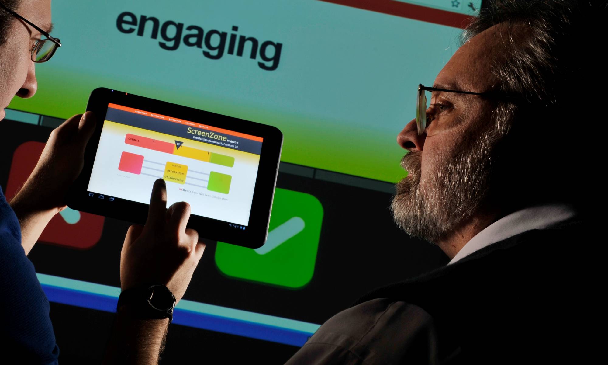
Can you avoid image-bloat problems completely by using image optimization? No. Sometimes it’s best not to use an image at all under certain conditions. Think about it. Does the image contribute to understanding the website’s written content? Does it attract, distract, or repel? Users are the judge. Not us. It requires testing.
How much testing? Simple. Ask just five people who aren’t related to you and aren’t your employees. That’s it. You don’t have to spend a lot of money or time. Irrelevant images are a waste of space. Reducing page-load time is still a big criteria for maximizing readership.
One big question: Are images attractive or motivating – and not alienating or repulsive? These questions address a primary component of web credibility. Credibility is the feeling web designers want to achieve. What is right isn’t always what feels good. If you put an ugly image into a compressor, it’ll still be ugly – but faster loading – when it comes out. There is even a possibility it may be uglier from distortions.
Two best ways to improve images have nothing to do with optimization: 1. Images with story appeal. 2. Images that demonstrate.
“Hero image” is a term used in web design for a specific type of web banner. A hero image is a large banner image, prominently placed on a web page, generally in the top, front and center.
A large hero image (usually a WordPress featured image) on a posts is irrelevant or generic if it doesn’t help move site visitors towards a conversion goal. There are only two critical performance metrics: sales lead generation and improved engagement (stickiness). Visitor engagement is indicated by click-through, page dwell time, and multiple visits. These are the inverse of high bounce rates. Information is no longer scarce – attention is scarce.
As content has grown increasingly abundant and immediately available, attention becomes the limiting factor in the consumption of information.
A high bounce rate means we’re attract the wrong people (traffic) – unqualified leads. The decision to leave a page is an impatient and intolerant “snap judgment” from interpreting subconscious relevance cues. These include typography, speed, readability, color usage, images, and symbols. These combined together are sometimes referred to as branding or design. In the end, it’s nothing more that a feeling of being in the right place.
If it takes the user too long to locate something, they will find it through another application. This is done, for instance, by creating filters to make sure the first content a viewer sees is relevant, of interest, or with the approval of demographics.
A large hero image is positioned in the most critical place to influence a visitor’s stay-or-go decision. It’s usually the first thing a viewer sees. It becomes a critical device for attention and engagement. It’s our responsibility to make sure the hero image is relevant to the user – it’s not a job for the viewer. Otherwise the image becomes attention pollution.
What are you providing by serving up a large featured image? Is it merely a cue to content? Or graphic signage to make pages appear different and less boring? Does the use of a large image communicate a message worthy of the longer load time? It the page real estate wasted?
What is really needed are systems that excel at filtering out unimportant or irrelevant information.
Users have words and phrases in their mind that will cause them to click on a link. We call these trigger words or cues. They are essential to good navigation. Users want to get to a site’s content as quickly as possible. For this, they use information scent. Good information scent give clues and implications that they are hunting and searching in the right direction. They “feel” they will find the solution to their need or problem soon. This is also called findability.
Is herd mentality affecting hero image choices?
Just because your competitor is using stock hero images in the banner of every blog page doesn’t mean it’s a good thing. The herd majority is presently doing this page design treatment. It becomes invisible or transparent. It is ignored. Why?
Milestones during typical page loads:
2.5 seconds for the headline overlay to appear.
3.5 seconds for the background hero image to appear.
4.5 seconds all critical elements are on page.
6.5 seconds for the page to finish rendering. Note: Lazy loading Facebook “garbage / widgets” during that 4.5 to 6.5 seconds window is the most common delay. That’s what takes so long for complete rendering. Can you hear our contempt for Facebook’s speed apathy!?
Double those times for mobile screens.
When you place text on top of photographs, you usually ruin the image aesthetics and the text readability simultaneously. This happens and is bad practice – but part of popular WordPress theme rigidity.
The background image (hero image) is sometimes much bigger than needed for mobile because of the desire to conform to large-screen, retina-display standards. This poor image decision most likely is made by a designer concerned first about their portfolio. Not mobile experience. A mobile audience doesn’t use these kinds of screens – let alone can afford them.
We need to limit the number of page design elements that compete for visitor’s attention.
The size of a typical hero image on sites is around 1920 pixels x 1280 pixels and is scaled to size in the browser window. HTML code downsizing means the browser must calculating page space on the fly – a bad practice for speed. It causes a screen-rendering delay as “the machine” stops to think. And only a small portion of the big image is actually seen. The Jpeg image can weigh above 400k! Optimizing a little bit more might knockoff 100k easily. WebPagetest.org agrees with us about that image-optimization assessment. But the reduction to 300k is still too heavy for mobile page loads.
COMPARISON USING STOCK IMAGE


Much of what determines where people invest their attention is below the level of pure reason. Indeed, research suggests that one of the most important factors for gaining and sustaining attention is engaging people’s emotions.
Mobile screens may be just 320 pixels wide.
One source of large, free hero images is Pexels.com. They have classy, professional photography. A typical Pexel image download is almost 700k page weight and 2682px x 1782px dimensions. Resizing and optimizing helps – but is still not good enough for mobile design.
The takeaway: The fastest image to load is – surprise – no image at all. Next best is a repetitive image that is already cached in the browser. But that can get pretty Spartan and boring. For information sites, textual content is more important than images – unless images illustrate or demonstrate a point.
Since Hero images frequently fill the whole screen, it forces users to scroll to find the point of your website. Hero images are frequently eye-candy and don’t have relevance to the article or blog post. It takes work and thought to find the right stock images. So, there is often a disconnect. Instead, using a call-to-action linked with an image would make more sense. Or even a large signup form. Publishing a positioning statement about “who we are, what we do, and why you should care” is good communications strategy and good ideas, too.
Large background images add a large amount of weight to a page for very little actual gain. Any user whose screen is generally smaller than 1024 pixels will absolutely not see the background image. Small screens simply don’t have the screen real estate to display content and background images. WordPress now attempts to load an appropriately sized “backup” image based on mobile screen size. But we aren’t seeing results in speed testing yet.
A video placeholder as a hero image is a creative technique by making it seem like the entire hero image background is a video that can be played. It’s just a static image that if you click on the “play” button you get a video Lightbox that starts playing a normal-sized video for you. The idea though is that the “play” button is the bull’s-eye of the top portion of the home page. The way it is placed makes you really want to click on it. Then the video sells you on the product or service.
Moving the header hero image down the page for lazy loading is wise, also. But is it still a hero image? We don’t know.
Better hero images do the following:
- Answer customer questions.
- Highlight your value proposition.
- Make an announcement.
- Feature a service or product line.
- Include a built in CTA button.
- Have consistent branding.
- Reduce customization for limited resources.
- Make our best promise that we can keep.
Good hero images contribute to the following feelings:
- Immediacy – priority access, immediate delivery.
- Personalization – tailored just for you. Personalization is one of the most important factors in viewers choice to attend to one piece of information over another.
- Interpretation – support and guidance.
- Authenticity – how can you be sure it is the real thing?
- Accessibility – wherever, whenever.
- Embodiment – books, live music.
- Patronage – “paying simply because it feels good.”
- Findability – “When there are millions of books, millions of songs, millions of films, millions of applications, millions of everything requesting our attention — and most of it free — being found is valuable.”
What kinds of images get immediate attention:
The factors most highly associated with getting attention, in rank order, are:
- The message/image is personalized.
- It evokes an emotional response.
- It comes from a trustworthy or respected source.
- It’s concise.
Messages/images that both evoked emotion and are personalized are more than twice as likely to be attended to as the messages without those attributes.
Can studying Google Analytics web statistics influence design color choices? More ways than you might think. But first you have to know where you’re at. And where you’re going. You must know what is most important. What is valuable and what is not? To answer that you need objectives – goals for making good choices. Even for something as simple as colors.
You have a WordPress website. This imaginary site gets good traffic. Monthly, two percent of your new web traffic comes from Facebook. Almost nothing! Social media has failed. Everything reported is organic Google search results: 100-percent traditional. Imagine your information site receiving 20,000 unique visitors per month with 18,000 leaving in under 10 seconds. Most everyone plainly perceives they landed in the wrong place.
Perhaps the description underneath the Google search link misled them. Somehow, you didn’t serve the information they were hoping or expecting. They then reacted negatively by hitting the back button – and kept on searching. On the web, people’s behavior is impatient and intolerant.
Of your remaining new visitors, only 2,000 per month stay for 3 minutes to over 30 minutes. Those are the people who are engaged and interested. They read content because it’s perceived as relevant. They watch videos in hopes of getting answers to their problems. They may even do something beneficial like signup or buy.
What if Google Analytics tells us 60 to 70 percent of visitors use Apple iPhone and iPads? Those real numbers are whopping. The majority is mobile. Is that normal? Sometimes. It’s happening on many sites now.
Your imaginary home-page, load-time is under 4 seconds. That doesn’t seem so bad. But Google reports your most popular landing pages are averaging 6-seconds or more to load. That speed (slowness?) doubles into about 12 seconds on a mobile device. This wait is beyond the human 10-second threshold of pain. Attention wanders. That means viewer boredom, frustration, annoyance, and abandonment increases. Hmm? No wonder the bounce rate is high.
You have a big user experience problem affecting website profits. Speed is killing opportunity. Can color help solve this speed problem? Maybe.
Speed is primary to achieve mobile site goals. We have to get past that barrier and achieve an ideal 2-second load time. Yet, we need branding (decoration) that communicates to the right audience. Decoration adds page weight. Bloat occurs on overly decorated sites.
Alexa gives us demographic data that Google’s free service can’t provide. What if our marketing goal is to appeal to an all female audience? Not men. But Alexa indicates 40 percent of site visitors are male. Men are unqualified leads. How can we subtly tell men to get lost and not waste our time? How can we entice women to stick around? Can we filter sales leads with color? Can color be “weightless”? (Weightless meaning not adding any page weight or drag to the site).
OFFSITE REFERENCE: https://www.psychologytoday.com/us/blog/brain-babble/201504/when-it-comes-color-men-women-arent-seeing-eye-eye
An unconventional solution.
Women know when a female designs a website. If your audience is female dominant, you need the touch of a female designer. Men aren’t so perceptive.
We’ll demonstrate. 259k Jpeg vs 17k PNG.
A PNG illustration banner or hero image consumes so few kilobytes because it’s visually simplistic. Visual complexity increases image file size. Therefore, consider using illustrations and graphics rather than detailed photographs.
But, you say, “They aren’t the same image! Is that a fair comparison?” Actually, yes, it is. Because they both communicate. An illustration is less complicated. It can focus the message with fewer details and fewer colors. This improves viewer attention. And speed!
That’s right. WordPress undoes your manual image optimization efforts. We use an offline image processor like Gimp or Photoshop for manual image production and optimization.
Few discover this hidden truth about WordPress automated image editing. It’s has an odd and strange ability to increase image files size slowing down speed. It only occurs if you use their photo editor to crop images. When it asks you to crop – “skip” it. That’s usually a better choice if the image is already sized. Uploaded originals are untouched when placed in the media library – unless you resize or crop such as an image thumbnail. Then things grow. Why? Who knows? WordPress looks the other way about this unreported speed problem.
Plainly, this upsizing strangeness isn’t a problem for most site owners or visitors. They don’t care. Otherwise, there would be millions screaming for a bug fix.
GIF is not an acceptable format for photos. JPEG is the better choice.
You as a site owner care more about image quality than the majority of your site users do. Image quality is way down the visitor-frustration list. Not significant. The number one complaint is slow loading pages being “the worst experience of a user’s day.”
Is Retina screen resolution important? There’s almost 1 billion active users of iPhone. And there are an estimated 300 million second-hand iPhone in use.
Retina display is a marketing term invented by Apple. Their primary goal is reducing eye strain when users read small type. Not improving image quality – a fortunate byproduct. It’s all about font-type readability.
There exist circumstances where images must be uncompromising. One is on portfolio sites. The other is with photography showing important product details. Both are instances where you’re selling something that depends upon good image representation. Images then are more important for buyer decision making. Product photo quality affects web profits. In all other cases, users aren’t discerning or are forgiving. They’d rather you build for speed and compromise in the image quality department.
Are you selling something on your site?
If you’re not selling, visitors only need to recognize what the color blob is. That is it. The caption is more important to users than photo quality. But often site owners neglect to use captions for better communications.
Building for Retina images is an exercise in futility.
When you *must* build for high-resolution Retina displays, there’s a superior way. Please read the article linked below. Remember to keep web goals in perspective. Some things don’t matter. Most web browsing today is on mobile devices. But mobile visitor expectation is low in many regards for type-font and image design. That doesn’t mean you’re justified in delivering garbage. But major image effort often has a puny return on investment.
We recommend WP Retina 2X plugin. Try it. Test it. But only if Retina-screen compliance is critical.
This novel plugin creates many new alternate high-resolution versions of your images. Another plugin feature is automatic detection of Retina displays. It then loads the high-resolution version of an image rather than the regular one.
WP Retina 2x serves up src-set images which pull smaller sized images off the server – and theoretically decrease bandwidth. – Ian Rance
Only 4 percent of site owners who install WP Retina 2X keep it. That’s a low-retention rate. It wasn’t worth the Retina-resolution hassle even when this plugin made image decisions and production painless. So there’s lots of variable screen sizes. Big deal. Retina-image preparation does NOT have widespread adoption by web designers or developers. It’s perceived a production annoyance (or non-feature) delaying site launch – and project payment.
These three offsite links below may help you make decisions. You have a design choice. You can workaround or ignore Apple-mandated techno-specs. We won’t tell.
https://mediag.com/blog/popular-screen-resolutions-designing-for-all/
https://deviceatlas.com/blog/most-used-smartphone-screen-resolutions
For PagePipe’s site, the strategy is not using photography for large headers. We choose the alternative of building custom illustrations for reduced load-time speed. That means using 8-bit GIF and PNG with 2,000×1200 pixel images with reduced color palettes. Those files weigh just over 21 kilobytes.
Where we use featured JPEGs, they weigh under 200 kilobytes. It’s fortunate the big “hero” image is lazy loaded by the default theme.
But the fastest sites on earth have no images. Only a small number of site owners make that choice (about 10 percent).
PagePipe screengrabs are JPEGs. They’re optimized harder than WordPress recommends. WordPress saves images at a compression of 82 – which is the equal to a Photoshop 50. Why is this important? It makes the images pass the WebPagetest.org criteria – a real speed test owned by Google. It’s most used by professional performance engineers. Not Google PageSpeed Insights for commoners. PageSpeed insights doesn’t even measure page speed in milliseconds. It only produces a weird score. They let you kill yourself for a meaningless 100 A+ while your site still remains a slug.
pagepipe.com/quality-82-image-compression-change-for-wordpress/
We build all JPEG images to screen dimensions. We optimize offline with a 70-quality setting (or more when we can). We use free GIMP image processor. We avoid cropping online with WordPress. We save-for-web our 8-bit PNGs and GIFs with reduced color palettes.
We’ve only had one client request Retina-quality images. That’s Steve’s brother, Brad Teare. High-end art galleries using fiber-optic connections were his target market. Speed was a nonissue. But we built the portfolio for both large screen and small screen, just in case. The galleries asked how he pulled it off. A great compliment. People’s curiosity sparks a speed question, “How did you do that cool magic trick?”
When we have a choice, we choose ignoring Retina specifications. And Retina’s been around for awhile. We may change our policy in the future. But we doubt it.
An unconventional optimization example.
The PagePipe “Start Here” page contained an animated GIF. It wasn’t built to the recommended spec of 2000×1200 pixel dimension. Instead, it’s 1132×697 pixels. We let the browser stretch with math and mess with this image. This is bad practice. Dimension recalculation causes small speed delays. So why do it? Because not doing so would produce an even worse super-slow page. Abandoned by users clicking the back button.
We also ran the animated GIF through an online compressor squeezing it’s file size way down. This introduced tons of noise and artifacts into the animation. Do we care? No. Because it’s good enough for average users. It’s noticed by inspector-type personalities. But 80 percent of visitors (or more) are oblivious and unaware of best design practices.
Being perfect in-every-way has too high of cost in time and money. “How good is good enough” is a hard judgment call. Relax your tolerances and standard so you can work on what counts most.
★★★★★
PNG to JPG plugin
Active installs: 2,000+
Zip file size: 10k
Description: Convert PNG images to JPG, free up web space and speed up your webpages:
- Set quality of converted JPG.
- Auto convert on upload.
- Auto convert on upload only when PNG has no transparency.
- Convert existing PNG image to JPG.
- Bulk convert existing PNG images to JPG.
REFERENCE: WPFaster.com: 10 speed changes for $1,985. Do them yourself with free plugins.
COMMON QUESTIONS ABOUT IMAGES
- How do I balance high-quality images/speed optimization?
That is a big question and it’s completely dependent upon your audience and your values as the site owner. For example, a portfolio site wanted quality above all else. The affluent audience viewed art on fiber-optic connections with large Retina screens. They also wanted images to still look good on small mobile devices. Those specifications let us know what solutions mattered and what methods to use.
- So what is “good enough” image engineering?
WordPress is already built to optimize images to a good degree. Generally, you only need a plugin for optimization if you abuse the system. Like uploading digital camera or phone images. There are conditions where you will botch or thwart the system. The most common is using PNG format for photos. Use them for transparent icons and solid color signage like logos. Save those not as 24-bit PNGs — but rather as 8-bit PNGs. Normal images should be JPEG photos.
When we optimize a site, we often find gross heavy images uploaded to the media library as PNG format photos. They aren’t resized or optimized. Site owners don’t realize these won’t be automatically compressed like JPEGS. Original PNG images are not optimized by WordPress.
A huge file from a camera can be upwards of 10 to 15 megabytes. That’s large. You shouldn’t upload anything over 100k to 200k. That’s right kilobytes. Not megabytes.
WordPress only optimizes *resized* JPEG images like “medium” or “thumbnail” or “custom.” The original stays big and fat. Unless you have a plugin like Imsanity installed. It will then crop and resize the image for you when you upload according to the plugin settings.
Imsanity has a setting selection to convert all uploaded PNG to JPG. But if you upload transparent PNGs, they convert, too. That’s not good. So we don’t leave this enabled.
NOTE: Some WordPress sites can’t be backed up because the media library was so full of huge files. Even when those files weren’t used on pages. The bloated media library was in Gigabytes.
The handiest plugin for the retroactive repair of a bloated media library is PNG to JPG plugin. This plugin ignores PNGs with transparency and leaves them unchanged.
PLUGIN: https://wordpress.org/plugins/png-to-jpg/
The default WordPress compression for JPEG images used to be 90. That changed a few years ago to be 82. That’s the same as saving in Photoshop with a quality of 50. That number originates from the WebPagetest.org test conditions. That image quality will pass inspection. But that doesn’t mean they *resized dimensions*. The worst errors are from not sizing. So how do you determine that best size in pixels?
Usually, the largest size you need is the screen width for your dominant audience. Rarely is that larger than 2,000 pixels. More often, the page column width is something like 700- to 900-pixel width. If in doubt, set large image size to 1,000px. Full-screen to 2,000px.
Services like free Smush plugin, do not resize – nor do they do lossy image JPEG optimization. That is what you want. People assume lossless is best. It is not. It will only improve images by about 10 percent. Whereas lossy compression improves images by 70 to 80 percent smaller file size. To get that, you have to pay for the premium version. Use a free plugin instead.
Lossy compression is imperceptible change to the human eye.
- I generally download from things like https://unsplash.com/
Those can be huge images.
- What size should I download?
No larger than 2000 pixels wide. But Imsanity will fix it if you upload a bigger file than that.
- Do I then upload and let a plugin compress? (I don’t have access to Photoshop and looking for an easy/high volume solution)
Imsanity solves the resize and compression issues during upload to the media library. The beauty of Imsanity — besides being free — is it doesn’t use an external server API (wait time). And it does both resizing and compression using onboard WordPress features.
- How do I handle the header image desktop vs mobile size?
WordPress chooses desktop and mobile images on-the-fly. Upload images sized for the recommended width in the customizer header section. For example, for Twenty-seventeen default theme header images, the dimensions are 2000×1200 pixels. The theme (core) will crop to those dimensions. Good themes do that for you.
WordPress stores 3 or more versions of your uploaded image on your server. They’re each sized in advance. WordPress decides which image size to load by the viewer’s device screen width. It’s smart.
- Does lazy-loading below the fold images help?
Yes. It helps with perceived speed. The load happens later or delays. It’s especially helpful on mobile devices.
- I’ve been uploading images through the Gutenberg editor inline (not to the media folder first, then selecting it in the editor – seems time consuming) – does this cause issues?
Sorry. We don’t use Gutenberg. We don’t know the answer. Few use the new Block Editor. Over 5 million site owners have disabled this non-feature. Many more don’t even know Gutenberg exists. They’re running older obsolete versions of WordPress. If you learned WordPress with the classic editor, keep it with the Classic Editor plugin.
Godspeed-
Steve Teare
performance engineer
March 2025
PagePipe Site Tuning Services for Speed
Instead of band-aid approaches, we drill down to the root cause of your slow site. This is origin optimization. Also known as site tuning. To do this, we analyze site components:
- Hosting
- Theme
- Plugins
- Scripts and third-party services.
- Images and media library.
- We minimize globally loading plugin effects.
Find out more details about Site Tuning – Get Speed!
Other Related Resources


Build with Empathy
GIVE SPEED