We always want what we can’t have. Turns out, scarcity makes people perceive limited quantities as more precious and valuable. This tactic boosts sales. Commodity theory proposes scarcity increases the value (or desirability) of an item.
Why does scarcity increase desirability?
- Scarce items feel exclusive.
- Scarce items appear more valuable.
- Scarce items make people feel powerful.
The bottom line: The more scarce an item, the more people want it.
Why is a countdown so effective as a scarcity tactic? Because we hate losing. The pain of losing is almost two times as powerful as the pleasure of gaining. You read that right: Losses can be 2x more painful than gains are pleasurable.
Loss aversion tactics remind potential buyers why they need to act now rather than later. Limited time offers put another psychological tactic to work: Fear of Missing Out, or FOMO.
The FOMO phenomenon is a “clearly fearful attitude towards the possibility of failing to exhaust available opportunities and missing the expected joy associated with succeeding in doing so.”
People hate missing out on a good deal which is why using FOMO is effective.
Limited time offers creates a sense of urgency. But scarcity extends far beyond the realm of limited time.
Can scarcity tactics boost your marketing and sales? Absolutely.
But only when used in the right ways, at the right times.
Scarcity tactics aren’t a quick fix for lagging sales. Instead, they increase the intensity of desirability for an item that’s already in demand. Think about it. Will slapping a timer on your offer magically increase demand? Probably not. Strive to build a loyal customer base who can’t wait for your new releases before tying in scarcity.
Too much pressure is a bad thing. Many of the scarcity-focused strategies create some anxiety-producing urgency. When you put too much pressure on your customers to act, they may feel like you’re forcing them into action. It’s an easy way to break ties with loyal customers.
Everything in moderation. Limited edition items are special because they’re different from all other offerings. That means you can’t make every single item limited, seasonal, low in stock, and only available for a short period. If nothing else, customers will get annoyed that you can’t regulate your inventory. Use scarcity in moderation.
Scarce items make people feel unique, powerful. They have access to something valuable and exclusive. Scarcity is why people perceive limited quantities as more precious and valuable. But it’s not a quick fix for lagging sales. If you use excessive pressure, you’ll end up scaring customers away instead.
What are countdown timer plugins?
A countdown timer shows how long a deal will last. They encourage customers to buy creating urgency psychology. Countdown timers let you countdown to a date, countdown a certain number of hours, create a countdown per visitor. It shows them how long they have to use a promotion.
You can have a limited-time counter start over on page refresh. Or you can enable session tracking and the timer will not refresh. Attention-grabbing countdown timer shows every second lost by not taking immediate action.
Countdown or expiration timers for WordPress and WooCommerce create boost conversions. They drive clicks, increase sales, and highlight upcoming events or deadlines.
False reports claim scarcity timers boost conversions by up to 350 percent. That’s baloney. Timers grab user’s attention and make them focus on your offer boosting conversions. That motivates users to place an order. Urgency and scarcity are powerful psychological triggers. They motivate shoppers to take fast action and avoid missing out on the following:
- flash sales
- seasonal promotions
- coupon code discounts
- pre-launch offers
- daily deals
- faster shipping deadline campaigns
- instant discounts
- early bird deals
- recurring offers
- sales promotion
- live events
- webinars
- product launches
Scarcity timer plugins are available for free – and paid. PagePipe focuses on reviewing plugins found in the WordPress free plugin directory. If you use scarcity as a keyword, only 4 plugins appear in the directory search results. Boo!
Below are the actual 20 listed plugins. We show their download zip file size, and why these offers are unacceptable. That’s right. All are bad for speed.
File download size is indicative of code bloat. Almost always, the fatter the package size, the slower the plugin.
There are three classes of scarcity plugin; light, middle, and heavyweights:
[table]
4 lightweight plugins,download kb
,
sdi-scarcity-timer,18
page-expiration-robot,25
checkout-countdown-for-woocommerce,30
t-countdown,46
[/table]
These lightweights either don’t work when tested. And yes, we did test these – except for the WooCommerce one, regardless, they call offsite APIs – or are broken. API stands for Application Programming Interface. These are keys to use offsite and remote server services. APIs mean standing in line for another server to respond. In the speed business, waiting for handshaking is always bad news. Talking back and forth slows sites down. These small plugins would be where we’d find a winner for speed. But not in this case. Brokenness or API requirements disqualify all the light plugins for speed.
[table]
9 middleweight plugins,download kb
,
wordpress-countdown-widget,106
countdown-timer-ultimate,141
smart-countdown-fx,186
countdown-timer,437
widget-countdown,556
beeketing-for-woocommerce,582
hurrytimer,744
sales-countdown-timer,779
countdown-builder,996
[/table]
Even if the middleweight plugins all work, they would still be slow loading. Why? Timers and counters are database intensive. They hit on the server database to increment a counter over and over. Repeating these requests drags down the server speed. Time-to-first-byte (server overhead) starts to lag.
[table]
7 heavyweight plugins,download Mb
,
scarcity-jeet,1.1
intelly-countdown,1.3
powr-pack,1.3
finale-woocommerce-sales-countdown-timer-discount,1.6
mwp-countdown,1.7
optinmonster,5.1
wp-maintenance-mode,5.8
[/table]
These are just ridiculous. They’re bloated, over-1-megabyte-in-size plugins. We won’t even test them. A waste of time. We’ve encountered them on client sites and know they slow everything down.
On eCommerce pages, the following slow down page loads:
- theme overhead
- page builder overhead
- eCommerce plugin overhead
- Time-to-first-byte
- SSL handshaking
Now add a countdown timer!
It’s too much going on all at once. It’s best to cut the countdown timer plugin for speed.
So what alternative do you use? How do you get the psychological response of scarcity without loading down your web page?
Here’s something we’ve tried with success: Publish a second buy button with text. No timer. We’re not kidding.
Here’s what we say:
Special 30-minute Offer:
BONUS ebook with purchase.Order BUNDLE.ME within the next 30 minutes and get “Toxic WordPress” (152 pages) for only 99 cents extra.
There is no actual timer ticking on the page. Does this work? Yes. Remember scarcity is a feeling – not reality.
To hammer home the idea, an imaginary clock is spinning away. We added a GIF-animation timer. It’s not real-time. It’s a visual cue or reminder. A 10-minute GIF countdown animation has too many frames. That makes it super heavy. But a spinning-seconds timer, is a lightweight GIF loop.
SPEED SUBSTITUTE

This GIF image contains only 12 frames.
And weighs only 7 kilobytes.
No countdown timer plugin loads faster than that.
So the next best thing for speed is a fake timer. It gets attention and creates a psychological feeling of scarcity. It works when people buy our ebook bundle. But it’s also our best offer, that counts even more to motivate.
There’s no magic in scarcity alone.


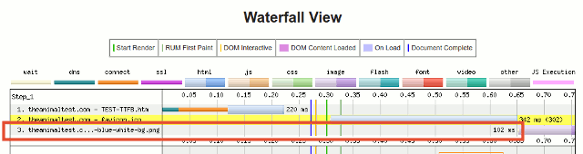
 Another favicon.ico sample above.


 A lightweight plugin alternative is installing

")
")


